It's been said, "necessity is the mother of invention".   No one knows exactly who said that but some site Mark Twain.   That quote evolved from, of all people, Plato who said, "Our need will be the real creator".

I would like to further modify that and say limitation is the mother of invention or the real creator.

Often we think of limitations imposed on us by others (i.e. parents, authorities, governing bodies, social norms etc.) but there is another self imposed limitation and that is the direction I'm moving in with my image making.   Before my camera work has always been shot in the 3:2/4:6 frame format and if I wanted something different I would crop that raw file before moving further in the editing phase.

I've decided to upend that by only shooting in 1:1 frame format.    Yesterday and today were my first days limiting myself in this way.   It's interesting how looking at the view screen and seeing only a square image changes how you think about seeing.    In some ways it's changed my subject matter.  In other ways it's changed how I photograph the same old subjects  that I would photograph before in the more familiar landscape/portrait format.  I'm still interested in the same things it's just that I am seeing them differently.    And it's not like I see them one way and they deliberately change how I want to see them via cropping.   I'm actually forcing myself to see them squared.

I don't know how long I'll do this but it will be for some length of time to see how this will change the way I see and perceive things over time as I get more used to this square format.

Todays images are of palms of my left and right hand.  An abstract, inverted presentation that I find interesting.    Again these images were shot square format /raw.   Editing in Photoshop.
So your driving along on a raining Sunday morning in an unfamiliar area.   You want to listen to The Talking Heads.    You tell Alexa "take me to the river".      But your GPS is listening instead and says, "take the next right.... now!"
LOL.

Now, you know, with the advent of AI - now GPS will give you the instruction and then start laughing at you, and tell you "don't believe everything I tell you".    LOL
That is not an easy question to answer. There was a time when democratic world leaders had a sense of duty, obligation and service and exhibited shame when they failed in any of those areas.
Those failures were often brought to light by protests from the population and of course media coverage of those protests.
But in the current global environment democratic world leaders by-and-large are either resistant or outright deny any culpability in the face of obvious truths and offer only a series of talking points with their true values being exhibited in their actions - often contrary to the lip service they provide.
In the internet age - there is literally an overabundance of media coverage and the more media companies there are the more options people have to choose how/where they consume their information. This overabundance of options has led to greater divisions as there are more and more options for people offering extreme views as every media company seeks to grab a larger "piece of the viewership pie". This growing divergence in the internet age has exasperated the divisions of population as everyone is now "selling"/forcing ideas instead of building consensus and using the art of persuasion.
This loss of consensus and the art of persuasion has caused irreparable damage.
The sad thing is no one cares. People only care about staking out their subjective opinions and anything to back them up. No one is listening.
When no one is listening you cannot build consensus and there is no art of persuasion.
In that environment can protests bring about change?
The protests I've seen here in America in the past 30 years have largely been ineffective. Oh sure they get a lot of media coverage. But they have not actually "moved the needle". There is no moral imperative in these protests it's merely people shouting "I'm right and you are wrong."
"If I speak in the tongues of men or of angels, but do not have love, I am only a resounding gong or a clanging cymbal." I Corinthians 13:1
So nothing changes.
People show up for protests for a day or two, or over the weekend and then feebly return to their useless daily existence, their jobs, their daily realities.
In order for protests to have actual effective change they must start from a basis of love for others and the protests MUST be sustained. But I don't see that happening any time soon. It would mean to protest would entail actual personal sacrifice maybe even losing one's job to keep protesting. That will not happen unless the economy tanks when unemployment skyrockets due to corporate cutbacks and there will be no federal assistance to help people.
I certainly do NOT want to see that happen but I think things will have to get a lot worse before effective change actually happens.
We're just shouting at the ground. Just more background noise.
I want to say "Thank you" for all who have stayed "under the covers" with me this month.  I hope you've enjoyed this journey through music and iphone images. Tomorrow is a whole new month, Spring is here and it is time to come out of hibernation.

For the last "cover" of the month I have a treat.    Abba, one of the best selling recording artists that have gone on to influence, films, broadway, and countless musicians -  had a popular song called Thank You For the Music, written by Abba member Benny Andersson.

In 2017 Benny had recorded an all piano album for the classical Deutsch Grammophon label simply titled Piano.  He re-interpreted Abba songs as concert piano music bringing the songs life full cycle.   So that is how I will end this series on this month of March.

To all the musical composers, performers out there, Thank You For The Music.    My life would be much less interesting and much less meaningful without the music you've given to the world.
Today an acapella treat.   One of my favorite acapella groups is, Grammy winning, Voces8.    They are a rotating group of 8 voices who perform and record works by contemporary classical composers.   But they also do some great covers that are lush - like walking barefoot on moss covered ground on a cool misty summer morning.  Well that's what their music feels like to me.

For Your Eyes Only, originally recorded by Sheena Easton as the opening credits song for the 1981 James Bond film of the same title.   While at times Sheena's voice seems a little "screechy", like broken glass, the Voces8 version is beautifully polished and sparkles.

And because I can't get enough of this vocal group I'll include a 2nd video of Voces8 performing alongside another vocal group known as Ringmasters.   They cover the Jackson 5 classic I'll Be There.   Enjoy.
The 1920's and 30's are often referred to as the Jazz Age.    That time when jazz music gained national and worldwide popularity.     There's a great TV series called Babylon Berlin (so far 4 seasons, with a 5th and final season yet to be broadcast).    Babylon Berlin takes place in the late 20's early 30's Berlin, Germany which saw the rise of the nationalist Nazi Party.    It is great drama against that backdrop of jazz and changing political and social times.

Many performers have been chameleons throughout their careers with the prototype being David Bowie.
With Berlin Babylon we see the emergence of another chameleon.  At the end of the first season and into the second (and I believe third season) Bryan Ferry, of Roxy Music (and solo) fame appears in the series.   He performs Roxy Music songs completely re-imagined as Jazz Age classics.

And so we come to the them of "cover versions".  It's not often when a musical artist so transforms their own work so that it not only maintains the integrity and hints of the original while become a stand alone work of art on its own.   He is given credit in the series as the Bryan Ferry Orchestra.    And they have recorded a couple of albums in the style of the Jazz Age.

Here again, I'm going to post 2 tracks.  First is the popular Roxy Music track AVALON released in 1982 and sent back to the 1920's/30's for a complete imaginative rework.    And below that DANCE AWAY from the 1979 album Manifesto.  Enjoy.
Okay today, "day after day", just today is about pure silliness.  Of course I'm talking about a lounge lizards cover of the Violent Femmes.  Yes, you read right.  LOL.     The year was 1983, punk was going strong, and the Violent Femmes burst onto the music scene.    A trio of raucous folk rockers with an attitude that could peel paint, playing at a speed that dared you to keep up.   An album cover that suggested, paradoxically, innocence and danger.

Well I still enjoy this album.   more for the nostalgia of the times than anything else. I suppose it was only a matter of time before someone decided to shake it up, martini style.   And no one better to do it than Richard Cheese.   From his album (inspired by Guns and Roses Appetite for Destruction) named Apertif for Destruction.  LOL.   Enjoy both versions.
So you probably never thought you'd hear U2 classic sung as a jazz piece.    Well here's your chance.
I've posted earlier another Kurt Elling cover of Stevie Wonder.   This time he takes on U2's song Where The Streets Have No Name.   And wow does he handle it beautifully and this live performance includes a really wonderful guitar solo by John McClean.   Really amazing work.   He originally recorded this song for his PASSION WORLD album in 2015.  The video is a live performance from the Blue Note, Milan in 2015.

Of course, down below is a live U2 performance also from 2015 of their original song.   The interpretations couldn't be more opposite.   Simply Amazing.   (oops I think I said that already.  LOL)
Well you can't have a series titled "under the covers" and not bring up the subject of sex at least once. Of course I'm talking about Sexual Healing. That classic Grammy winning song by Marvin Gaye in the early 1980's. I've always liked that song. Not loved it but liked it. It's got a nice groove to it. Plus I've always been fascinated about talking about sex so openly. When Marvin sang the song it almost felt pornographic. What I mean is that it was "out there" for everyone to see. That brings me to todays cover.
Ben Harper has been a music artist I've followed since 1997's WILL TO LIVE album. Four years later he would release a double live album that (for me) ranks as one of the top 10 Live recordings of all time - LIVE FROM MARS. I had an opportunity to see Ben Harper & The Innocent Criminals live during the LIVE FROM MARS tour. Simply one of the best live shows I'd ever seen in my life. On that album Ben covers Marvin Gaye's Sexual Healing. This is my favorite version - it feels really passionate and intimate. Even though it's a live setting it still comes off as intimate. The live video I'll be posting will be Ben Harper at the Hollywood Bowl (2003) and the Marvin Gaye video will be his Grammy winning performance from 1983.
Nina Simone will probably always be remembered as one of the finest interpreters of song.  She has covered some of the biggest songs of her generation.   But her songs are not mere covers.    She completely re-interprets songs making them personal statements, protest anthems, consciousness raising art.

Today I'm posting her cover of Bob Dylan's, Just Like A Woman.   In Dylan's original version he is merely making an observation but when Nina sings it,  she OWNS it - she makes it all about her.
She identifies with and personalizes it to depths that make it one of the most emotional renderings of this song.
Screamin' Jay Hawkins.  Was there ever a name that wrought so many emotions and strong opinions?
Todays selection is Screamin' Jay Hawkins cover of Ice Cream Man from his controversial album, Black Music For White People.

In many ways Screamin' Jay was just an ignored opera singer - that's what he really wanted to be in life but no one in the classical community were in a mood for another black opera singer after Paul Robeson so Screamin Jay took up night clubbin' and developed an act that was part voodoo, religious snake handler, and he always had a coffin on stage and a skull he affectionately named Henry.      His music was bawdy, daring, even dangerous sounding.    But boy did he have soul.

Ice Cream Man was originally written by John Brim.   But was probably more recognizable by the cover version recorded on 1973's self titled album by Van Halen.    So here are all three versions.   Enjoy.
Can anyone beat Stevie Wonders delivery? Well probably not but Kurt Elling does a wonderful job on Golden Lady. Originally released in 1973 as part of the album INNERVISIONS, Golden Lady became one of Stevie’s (many) signature R&B/pop songs. The song, as recorded by Stevie Wonder, was heavily inspired by “Montuno” Cuban rhythms and syncopation (on the chorus).
Kurt Elling changes it up into more of a swing which is very cool. From his album THE GATE, Golden Lady was one of several pop and rock covers. Much smoother, very different, yet very cool.
Another cover that made me fall in love with a music artist I'd not heard previously.
The year is 1995.   I had been of Tom Waits for a couple of decades at this point.   I could never have imagined someone doing his music justice as a cover.

Then along came Temptation by Holly Cole and her trio.  An entire album of Tom Waits songs.   In fact I'll have to post 2 videos from this album.  She manages to maintain all the dreamy quirkiness of Tom Waits with a silky smooth breathy voice that will take you to another dimension if you close your eyes and let her.  So enjoy this trip with a pair old back catalog classics.
Van Morrison (for me) is kinda like Bob Dylan.   I love his music - as long as it's performed by someone else.
I totally admire their contributions to popular music, culture and songwriting.

This cover by Cassandra Wilson from the Blue Light 'Til Dawn album is the song that made me fall in love with Cassandra Wilson.   Her voice is like honey and it flows musically like thick sweet honey.    Just amazing.
Sting is probably one of the most often covered pop songwriters.    Especially by jazz musicians.
And FRAGILE is probably one of the most oft covered songs of Mr Sumners.  Sting has always had a relationsihp with jazz.   In fact his first couple of solo albums featured many jazz musicians that have come to to be seen as masters in their own right.

Here is a truly delightful cover of the FRAGILE by the Andrew McCormack Trio from 2022.  I love how they start out as a smooth standard then break out in the improvisations touch base periodically on the melody.   Really Enjoyable in my mind.
Probably one of the most popular songs by Metallica.    Covered by many many people and bands.   But few have taken this bold visceral vocal approach by Polish vocal group Tulia.
Enjoy.
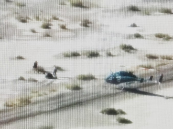
In this image, after NASA recovered the capsule they moved it into the white room - a special vacuum, dust free environment to open the capsule so as not to contaminate its contents. Looks like an alien autopsy to me. LOL
Continuing with the Bowie covers - Here is a wonderful instrumental version of David Bowie's LAZARUS from his final studio album Blackstar.     It's been written that David had long wanted to work with a jazz band.   He has worked with some of the best contemporary jazzmen, including that guys in this video.    Enjoy Donny McCaslin, Mark Guilianna, Jason Lindner and Tim Lefebvre.

The video starts well into the Tiny Desk Concert performance with Lazarus and ends with an additional song by McCaslin.     Enjoy.
Today and tomorrow will feature images I “snagged” off NASA’s YouTube video of the sample return mission. I really like how these images are not the best quality – in fact I did make an effort to further distress them so they look more like some out of focus image you might find on a tabloid.
Seeing this felt so alien to me and in fact we were watching something alien (not of this planet) that was captured and brought back to earth. So it seems fitting that I would want to feature covers of my favorite earth alien – David Bowie.
LIFE ON MARS is one of many Bowie favorites. Here is is covered by award winning jazz and classical pianist Brad Mehldau from his album Your Mother Should Know – a recording of Beatles covers and one by George Harrison. The bowie track closes out the album as a way of making connections between the songwriting of the Beatles and the great songwriters who followed. Enjoy this wonderful solo piano version.
Philip Glass has long been a favorite composer.   I've been following his work and career since his opera of Einstein on the Beach.

In 1977 David Bowie released "HEROES" the second in his Berlin Trilogy series (the first being LOW).   It was a ground breaking album that was co-written by Brian Eno and featured some guitar work by King Crimson's Robert Fripp.    An amazing conceptual work overall.

Here Philip Glass has covered that album or perhaps more accurately used those musical ideas to re-compose the music into a symphony as only Glass could do.   Featuring many of Glass' signature motifs (repeating phrases etc).   It really is a work of art in itself.    And this is the way I like to see covers done - re-imagined with respect and reverence to the original.     As I've said before faithful covers/copies are not of any interest to me as I suspect you've noticed by now.

Enjoy this title track from the "HEROES" Symphony by Philip Glass from the music of David Bowie and Brian Eno.
A bit of trivia: the live Bowie version below features guitar work of Ohio native and future (80's era) King Crimson Alumn Adrian Belew.
The image above is titled "Afterma[N]th" and is my impressions of the aftermath - what the world will look like after man unleashes the full fury of it's hate against each other and the world in general.   An apocalyptic vision to be sure - bloodied, bruised, broken, eviscerated.

The soundtrack for this has to be an album recorded more than 30 years ago by the militaristic and industrial sounding techno group Laibach.    Their album NATO (released 1994) features covers of songs with a theme of war.  Today's post will be different due to the number of videos posted I will not include the original versions but you can find them on YouTube if you wish.

It opens, perhaps appropriately with Gustav Holst's MARS, BRINGER OF WAR.  In the hands of Laibach this classical masterpiece is vivisected by a techno beat dragging it bloodied and screaming into the 21st Century.
History will remember 2025 as the year America abandoned democracy, first by waging economic war on its democractic allies (“I always say tariffs are the most beautiful words to me in the dictionary.” - blah blah blah).  Secondly by literally siding with authoritarians (Russia) against a democratic nation (Ukraine) and literally abandoning the North Atlantic Treaty Organization (NATO) that it helped found after WWII.

WAR by the temptations is wonderfully re-invented here.   Featuring the familiar "war chant"  and goes on to list corporations and organizations that have helped prop up the US military machine.    Obviously war is good for profits - the economic engine -  even as it destroys humanity and the planet.  The very antithesis of "values" and "morality".
Capitalist claptrap.
Next we have a track that I have never liked in it's original form. Final Countdown by Europe. Here Laibach re-imagines it as the final countdown to human extinction - which feels more contemporary than the original ever did. Maybe because of the times we live in - with the world at large embracing - "strong man" far right politics. It just feels like we are in the final countdown to oblivion.
While the NATO album only has 9 tracks - the tracks form a concise document behind the theme.
Track 5 is Pink Floyd's DOGS OF WAR from their Animals album.    As mentioned earlier, the US and the world have lurched into an aggressive, militaristic stance.    We should not be surprised.

"...Our currency is flesh and bone... one world and we will smash it down".   Really describes what we are living through now.   Our political leaders value military strength fomenting a dark misguided vision of masculinity that seeks control.    Our political leaders were elected to "serve" but service is not part of their vocabulary of understanding.   They only seek control.   They court votes strictly for this purpose  even though they mislead the electorate in their campaigns.  The masses are deceived and because they are not able to discern or think long term they vote with their hearts instead of their minds.
“If man is still alive, if woman can survive….” Finally we look toward the future with Laibach’s cover of Zager & Evans 2525. Which looks at the future of humanity in light of what has happened, and is happening. Will humanity survive? is the question of the hour. My belief in “remnant theology” tells me that humanity will survive even if extremely diminished numbers and devolved back into a pre-industrial state of existence. Humanity will evolve. Technology may also survive in part but progress, as we know it, may be irreparably damaged. Can we stop it? I want to say “yes” but honestly have to say “no”. Those that would make a concerted effort to bring long term change will always be beat down by the dogs of war – strong men who value strength over service. They only care to press others into servitude to themselves and their cause.
I said earlier – we should not be surprised. Speaking specifically for America. We have been on this trend every since August 9, 1974 when Nixon resigned in disgrace on got on the helicopter to get the hell out of dodge. Politics was broken. It was at that time that people first started saying things like, “Our government needs to be run more like a business” which is exactly what happened. Business interests took over politics and the influence of wealthy and powerful businessmen gradually and slowly took over governing. Until now we have a president who is a business man with the wealthiest man at his side doing to government what they would do in their own businesses. And while A person may get away with being dictatorial in business it should NEVER be applied to government.
Wealth is worshipped in America. I know many that would argue that and say they “respect” wealth and wealthy people but that’s a disingenuous admission as they themselves wish to rub elbows with the wealth and see wealth as a means to get what they want. When we look at the billions of dollars poured into political campaigns and see so many options for that money to be used for the betterment of humanity – we can assert that something is very wrong with America.
The other thing is the electorate itself that have voted these people in charge and given them free reign to do what they will. The electorate is unwilling, and therefore incapable of making a good informed vote. Why is that? One thing I noted during the Reagan years, when I became of voting age, was that the vast majority of people voted with their feelings not their minds. They relied entirely on the media to provide them with information that turned out to be biased, and as election advertising gained exponential momentum, information became insurmountable. So people have, ever since, just voted with their hearts – their feelings. People have voted on the most surface of things, a candidates looks, the way he carries himself, his age, does he/she say things I want to hear? People have taken the narrowest of views and limited their thinking wanting easy decisions. Well we have what we voted for. I’m amazed to hear stories of people that voted for this are shocked by what has happened to their jobs, our country’s status in the world, individual rights and the economy.
Let’s face it we wanted it, we voted for it and we got what we deserve. Goodbye democracy.
On a final note.   I mentioned earlier that the american electorate votes with it's heart instead of it's mind.  This is something the Republicans have masterfully adapted to.   They understand that they can tell as many lives, spew as much misinformation and mischaracterization of their opponents and it will not matter.  What matters is how their voters feel.   Unfortunately Democrats are on track to lose the midterms because they have completely failed to understand the american voter.   Democrats are spending ALL their time playing defense trying to refute the lies, misinformation, character assassination (which they NEED to do - it cannot go unanswered) but they need to find a way to do that and still reach the hearts of the electorate.    If they can do that they can win the midterms to wrestle back control of the senate and possibly the house of representatives.    Right now they are talking impeachment (again) and honestly they need to let that go because If Donald Trump survived the two impeachments in his first term he will survive any impeachment attempt now when his actions are even more egregious than when he first took office after 2016.    I fully believe he needs to be removed from office but it will not happen when he won the popular and the electoral vote.   It's time to "get real" Democrats.

Is resistance futile?   The way everything is set up currently - it is futile.  But if Democrats, media and populace change their tact - resistance may pay off.   Time will tell.   LONG LIVE THE RESISTANCE!!!!!
While I've been posting jazz or classical covers of rock/pop songs I want to do something different today.
I've been following Rodrigo y Gabriela since 2009 release of their self titled album.      Amazingly talented guitar players.   They both have their origins in Mexican heavy metal but quickly grew tired of that scene.
In 1999 they moved to Dublin in spite of the fact they spoke no English.   They took their time to hone their sound by busking/playing live on the streets of Dublin, Ireland.

Here they cover LINGUS originally recorded by multi-award winning jazz group Snarky Puppy.  The track was on Rodrigo y Gabriela's  3-song Jazz EP released in 2021.   Snarky Puppy first released the song on their 2014 album We Like It Here.   Both versions are really quite amazing.   Enjoy.

Incidentally, Michael League of Snarky Puppy who composed LINGUS paid compliment to Rodrigo y Gabriela when he remixed their version of LINGUS for digital release.
I continue to be amazed at how Jazz musical artists seem to regularly find inspiration in the rock band Nirvana. I just have to post this excellent and delightful cover of Nirvana's COME AS YOU ARE from their breakthrough album Nevermind.
Charlie Hunter has become a staple on the jazz scene not only fronting his own ensembles but guesting with numerous others on the jazz vanguard. COME AS YOU ARE is the initial offering under the name Charlie Hunter Trio from their album bing, bing, bing!
Nirvana were from Seattle and were intricately interwoven with the grunge rock scene and their success helped make the descriptive "alternative rock" label a household phrase. Initially the alternative rock label was really just to say the grunge rock was an alternative to the heavy metal "hair" band that preceded them.
I'm always "game" for the unexpected when it comes to music.   And today is a perfect example of that.
Bang On A Can is a contemporary classical collective based in New York City that have pushed boundaries of classical performance.    The Asphalt Orchestra is the name of Bang On A Can's marching band.   Yep you heard right.    And talk about pushing boundaries - Asphalt Orchestra have recorded an entire album of Pixies songs.   The Pixies' the popular 4AD label band that was edgy in it's own right.

Here is Asphalt Orchestra's live performance of the Pixies classic WHERE IS MY MIND (incidentally that could be the name of my biography LOL).   In this video the string quartet with the Asphalt Orchestra is none other than Kronos Quartet (classical boundary pushers in their own right).

Enjoy this live video along with the Pixies version below.
Kronos Quartet are a popular contemporary string quartet.   They had many works composed specifically for  them by some of the top contemporary composers around the world.   They also have adventurously taken on string quartet version of jazz, rock  and pop music.

An ongoing crowd favorite in live performance is their cover of Icelandic "post rock" wunderkind, Sigur Rós' Flugufrelsarinn.    Like all the best covers they have re-imagined this work dragging it into the realm of classical performance.

The song first appeared on Sigur Rós' 1999 breakthrough album Ágætis byrjun.  It's hard to believe more than 25 years have passed since then.    The groups name, Sigur Rós came about because one of the band members had a sister named Rose.    "Flugufrelsarinn"	translated is Savior of the Fly and the album title ætis byrjun is translated as A Good Beginning.

Enjoy both the Kronos and Sigur Rós versions below.
We are into week 2 of Under The Covers and today I have a funky Monday treat.
Marcus Miller with his take on the Hendrix classic PURPLE HAZE.     And I have to say it's great to hear David Sanborn play something other than the "smooth jazz" he's usually associated with.
And now the Hendrix version. Go ahead “kiss the sky”.
PAINT IT BLACK by The Rolling Stones is (I suspect) one of the most covered songs from their catalog of great music.  It first showed up on their album AFTERMATH and it is a personal favorite of mine.

This version by Joe Pass from his recording THE STONES JAZZ is no exception when it comes to great cover versions.    However, at the time this album was released (1966) it was savagely reviewed and ridiculed for being yet another jazz music great jumping on the pop music bandwagon.   In fact as recent as 2015 a reviewer for the ALL MUSIC GUIDE said it is the most unlikely candidate to be released on CD.

In retrospect - I think early criticisms are unjust and this album deserves a second chance.    The grooves are interesting and worth a shilling or two to download.    Enjoy
And now the Stones version from 1966 from a television broadcast.
Today I want to share a great cover of, arguably, one of the greatest rock bands of the 1990's-2000's RADIOHEAD.    Todays track is Weird Fishes and is covered by the Noordpool Orkest.   In fact the Orchestra recorded an entire album of jazz orchestra covers of Radiohead songs.   It's worth checking out.   The album is titled RADIOHEAD: A JAZZ SYMPHONY.

Enjoy.
And now Radioheads original version. The song is originally from their album IN RAINBOWS.