"Brother, my cup is empty
And I haven't got a penny
For to buy no more whiskey
I have to go home..."


Sun rises in fog
Sleepy morning waking up
Light dance on treetops


Color range on tree leaves in Autumn is like nature's swag. These are "Swag Times".

Autumn's a funny season.   It's always remembered for the changing colors of natures garments.   But that is, in reality only a short part of Autumn.   This week, the first week of November, about one week after this photo was taken, the leaves are almost 100% down (gone, kaput).   Autumn starts in September when leaves are still green and by the second week of October the change in leaf color escalates and you blink and it's over.    The rest of Autumn (the majority) is marked by dark skies, rainy (or snowy) weather and bare trees.
I suppose that's what make Autumn colors so special - the brevity.   It's temporary status.   Trying to hold on to it is like trying to hold water in your hand.    It slips away of it's own accord, in it's own time and is gone.
Kinda like life.


you're looking for an answer
stuck inside the comfort of your mind
your ground is slowly freezing

even by a furnace breaking into sounds


these days it's never easy
problems come and go
they're aching all the time
searching for a way to compromise

you say you're sorry
, but you failed to recognize
there never was a need to apologize
if you try to get by
then with time they will understand

old paths are slowly fading
for the strength that has been building up inside
we've spent a lifetime learning
each broken purpose rebuilt to former heights

always trying to find the perfect line


you say you're sorry,
 but you failed to recognize
there never was a need to apologize
you say it once more
, but never realized
there never was a need to get it right

if you try to get by, then with time they will understand
if you try, if you try, in the end they might comprehend

all is well in the end all is well
all is well in the end all is well


This past week I've been thinking about the titles that people use/don't use on their artworks.   I've heard arguments for and against titles in our time.   The most common argument I hear about titles in our internet age is that the key words in a title can help people find your work more easily if they are not already followers of yours.   On the other hand, I've also heard that titles are a distraction from the work in question.

This has led to two basic approaches to titling ones work.    First either listing it as a most banal, plain descriptive title (i.e. "Flowers With Vase", "Farmhouse", "City Life" etc) or simply no title at all (i.e. just a blank space) or using the word "Untitled".

What if both of these approaches are wrong?  Might it be simply a sign of laziness on the part of the creator to come up with a captive title?  I have certainly been guilty of this lazy approach.   Wanting to post something but not wanting to spend time with the image I've created to think about what it could mean or what the image could "say".   I think, as a creative exercise, that a title should be approached as a writer who writes a book.   After all who would read a book with no title on the cover or simply the word "UNTITLED" on the cover?   Who would read a book titled, "THE BROKEN DOWN CAR"?   Maybe some would but it is not very likely.   What if we put as much effort into a title as a writer puts into a book.

Add to that, who says titles have to be short?  Are long titles a distraction or can they actually illuminate artwork much as artwork can illuminate a good literary work (as was proven in ancient times).  I suppose listening to the post rock genre of music is to blame for my conundrum.   There have been many post rock recordings with album and song titles that go beyond the common 1-4 word limit that most recordings use.

Examples (band name followed by album or song title)
- The Silver Mt Zion Orchestra - HE HAS LEFT US ALONE BUT SHAFTS OF LIGHT SOMETIMES GRACE THE CORNER OF OUR ROOMS
- Explosions In The Sky - THOSE WHO TELL THE TRUTH SHALL DIE, THOSE WHO TELL THE TRUTH SHALL LIVE FOREVER
- Hammock - RAISING YOUR VOICE... TRYING TO STOP AN ECHO
- Godspeed You! Black Emperor - LIFT YOUR SKINNY FISTS LIKE ANTENNA TO HEAVEN
- Red Sparrowes - THE FEAR IS EXCRUCIATING, BUT THEREIN LIES THE ANSWER

In Truth there are many great short titles also but I think there is less substance (or maybe thats not the right phrase) or requires less from the listener.
The titles of the albums listed above is a literary art in itself.   I would argue that it provides an additional context for listening.  Not only the casual listening that one gives a pop song but a deeper listen that engages ones imagination, intellect and emotional complexity.  A longer title can be a literary short-form poem, even a haiku.    It doesn't take away from the music but enhances the listening experience.    Or, in working with images, as I do... enhances the viewing experience.

For the visual arts a longer title can lead the viewer into the image from a different point of view.  And has the opportunity to change the viewers experience and possibly behavior that has become so prevalent in a click-bait world.   In short I will do anything to slow the viewer down to enjoy the experience of the image.

Here are some images of mine that I've recently created with longer titles.   Let me know what you think about this topic in the comments.

WE LANDED FOR THE STORM BUT WHEN THE STORM HAD PASSED WE HAD FORGOTTEN HOW TO FLY
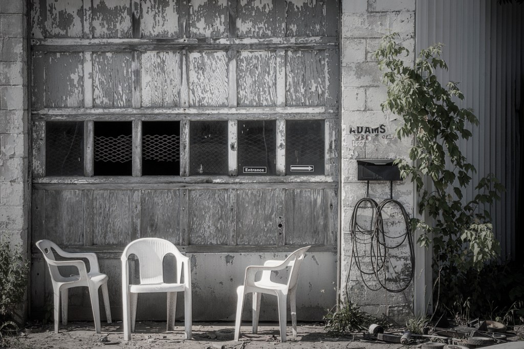
WE SAT UNTIL WE COULD SIT NO MORE, BUT WE ALSO COULD NOT STAND, SO WE ASCENDED
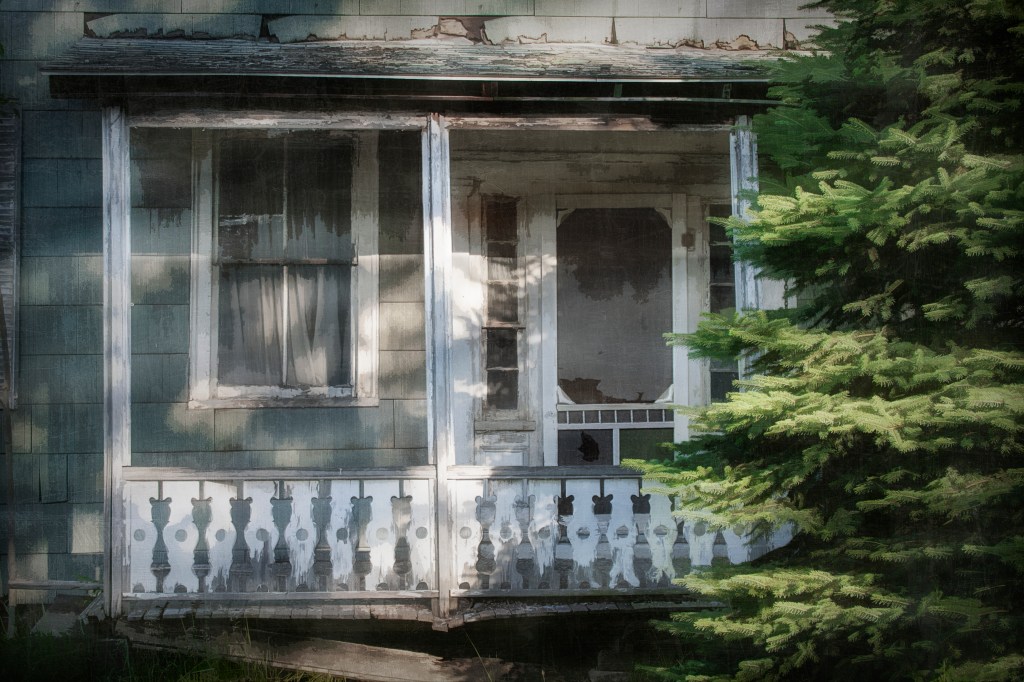
I LOOKED AT MY HOME AND SAW THE EXPERIENCE OF MY SOUL
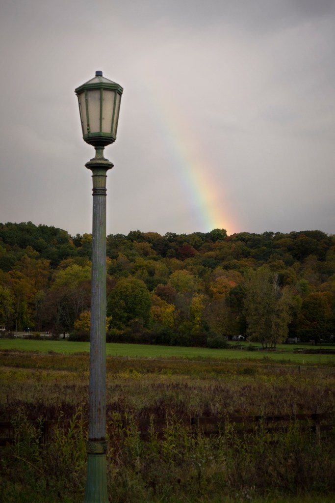
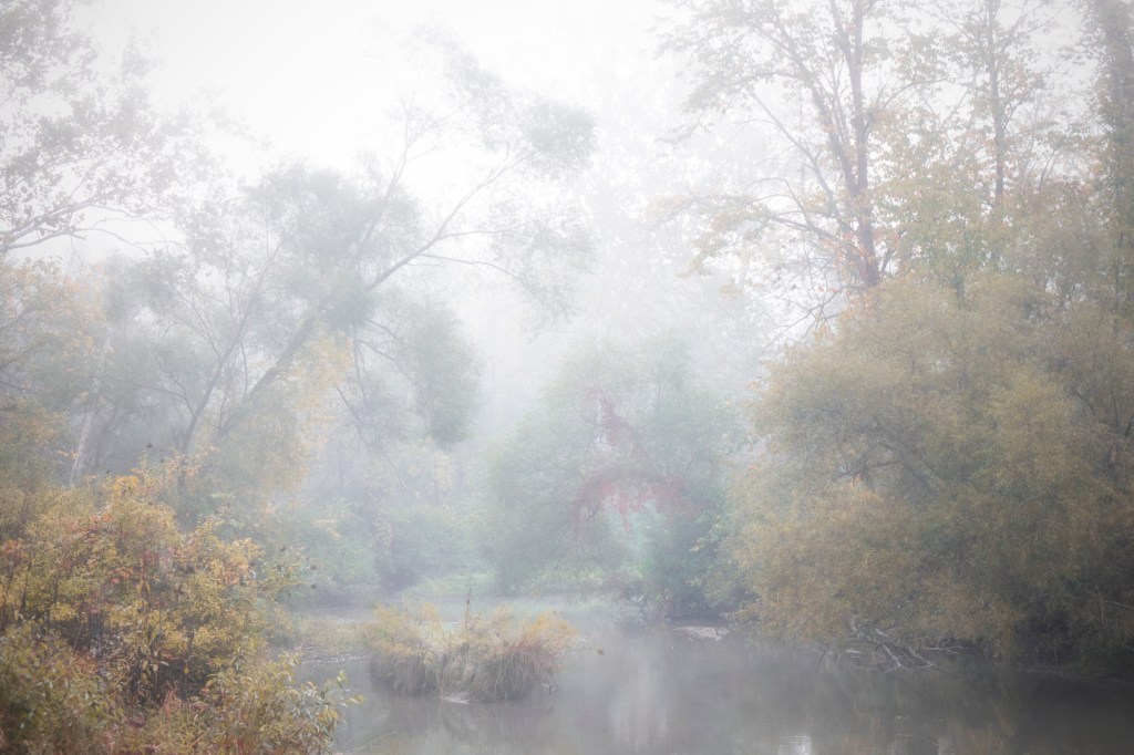
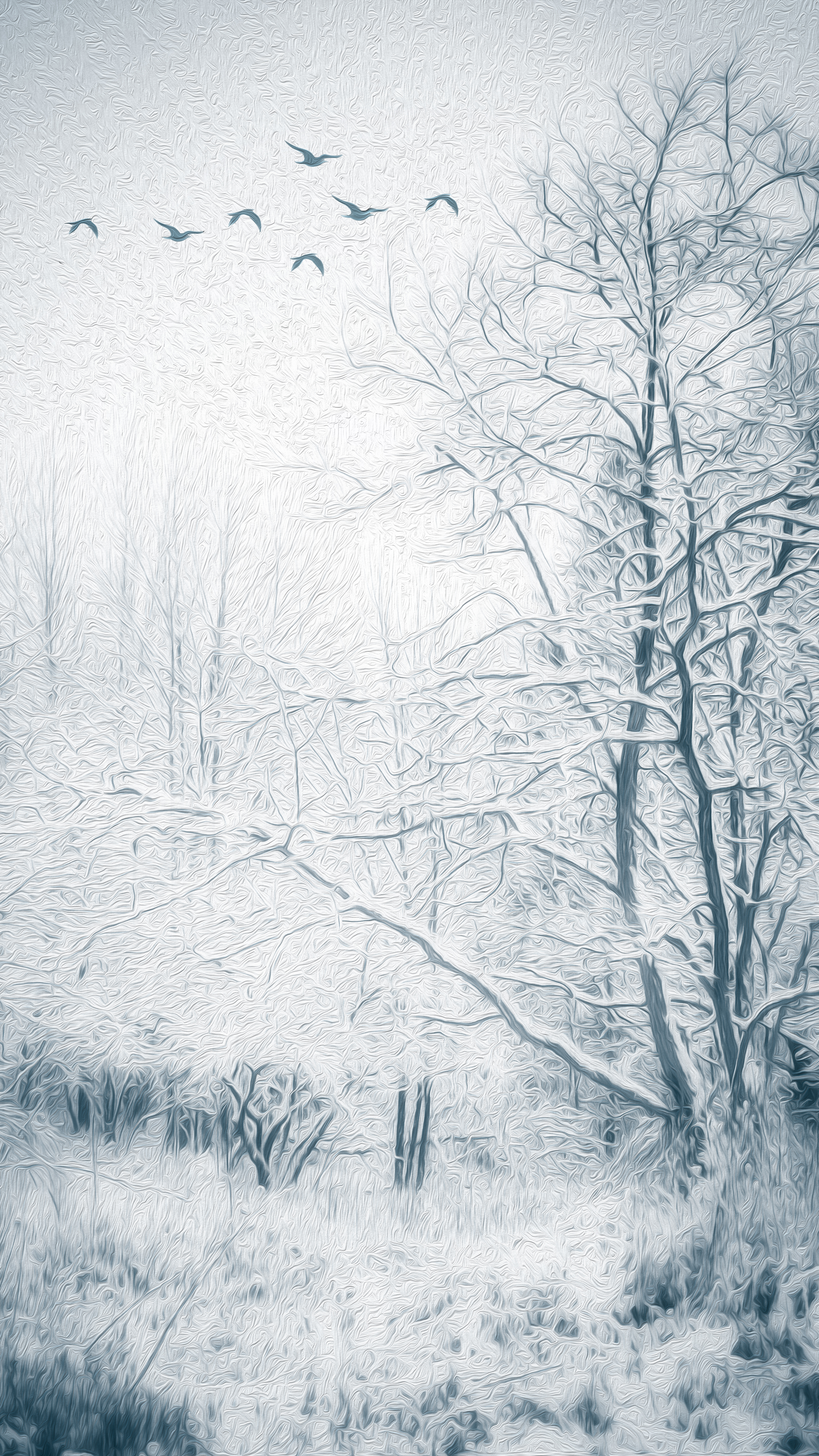
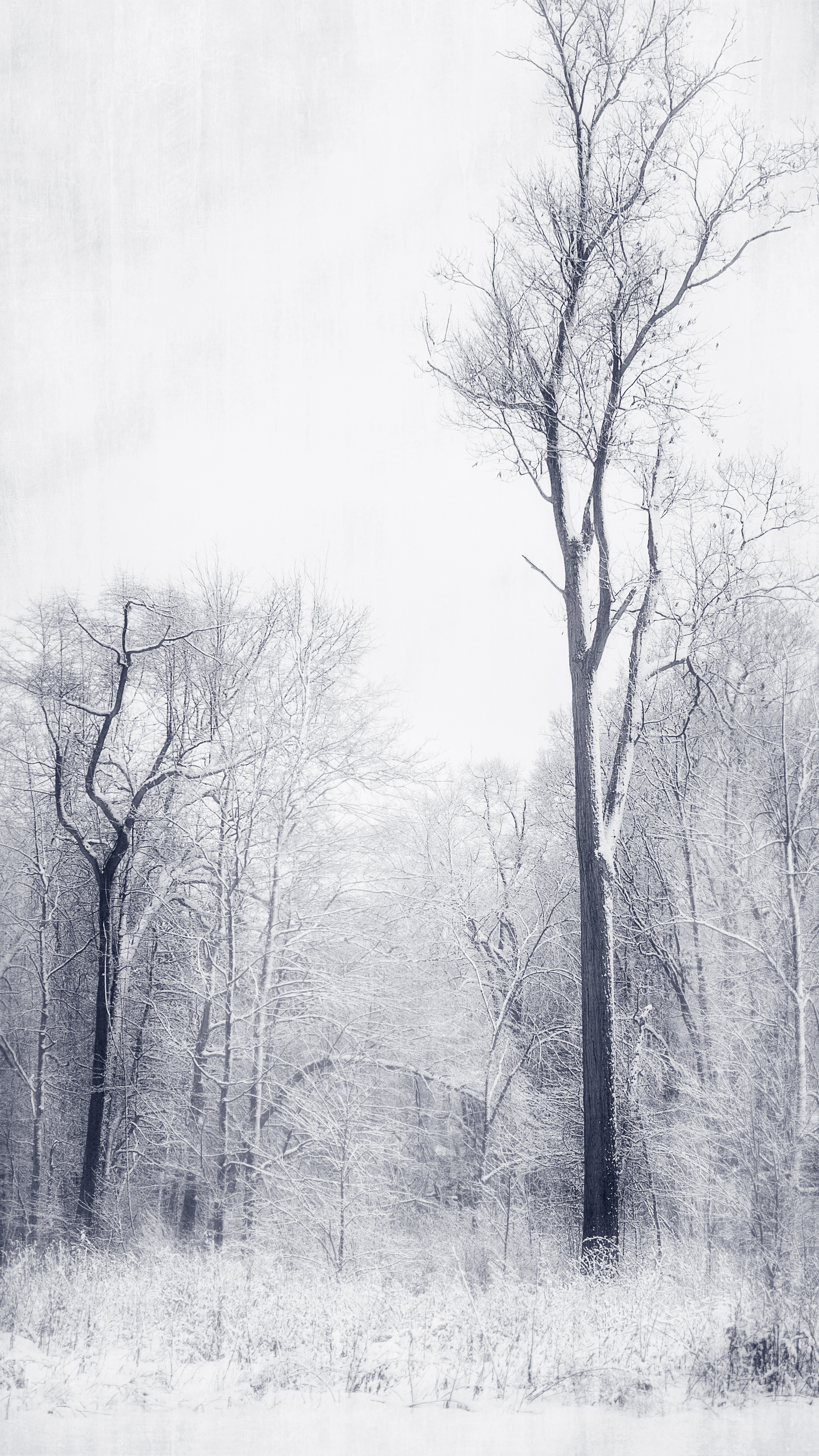
In my photography I've started thinking about "how I can make things look longer or taller."   I think the right crop might be the answer.   The two photos today are examples of my pursuit of this idea.    I've always loved vertical landscapes which comes from my interest in vertical Japanese woodblock prints like the ones by Utagawa Hiroshige.    I think the particular crop in these two photos,  which is a vertical 16X9, creates this effect nicely.   It makes the main subject of tall trees look even taller in my mind.  It "heightens" their already magnanimous stature.    I also used various textures and effects.

What I find really funny is that the main tree in the photo on the left is significantly smaller that the tall tree in the photo on the right.  It's more of an overgrown shrub, actually, that is about 12 ft tall compared to the large tree on the right which must be about 50 ft tall.    But again, I think the crop really goes a long way to lengthen this tree.   Hope you enjoy.

What do you think?  Is the crop pleasing to your eye?   Or is it just too much?
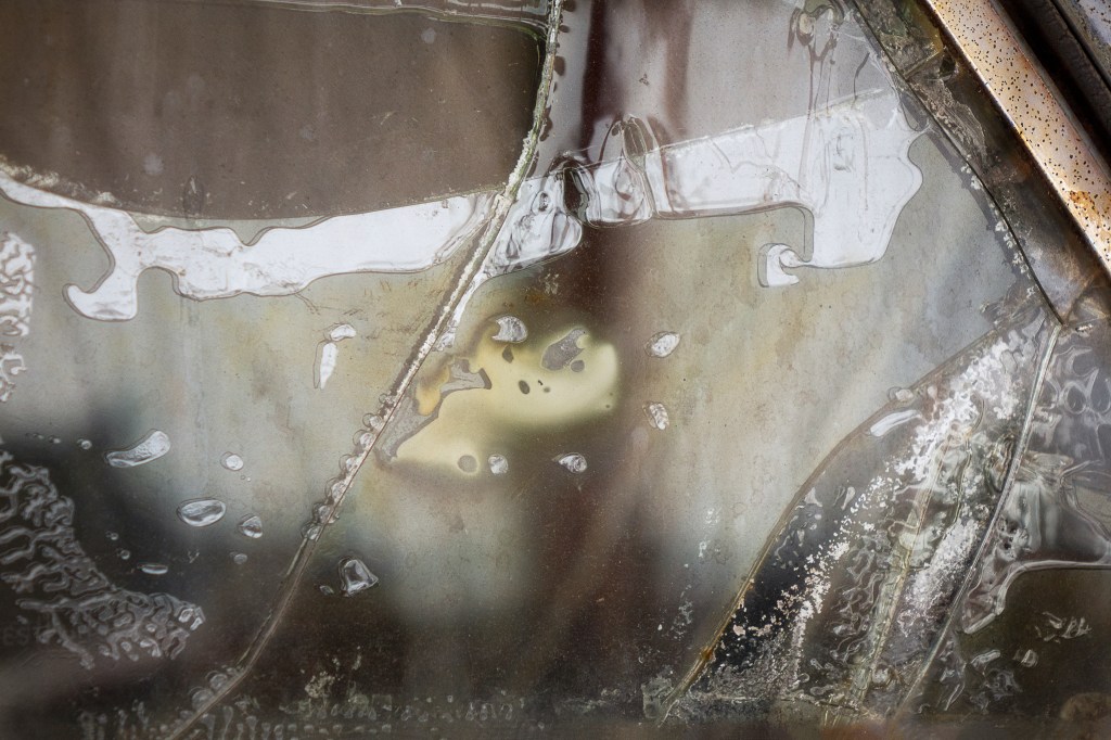
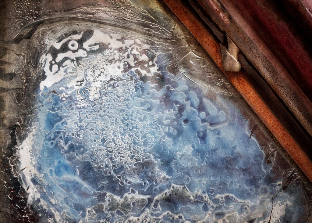
The virtue of looking back thru old files. In todays example files from 2018. I remember when I took these two photos I was intriqued by what had happened to the glass of this automobile. We are used to glass cracking, breaking and shattering but this glass seemed to be in a slow-motion movement of decay. I've paired each image from a song from Philip Glass' SONGS FROM LIQUID DAYS. When I listen to the music while staring at the photo - it generates a deep level of emotion and imagination in me. I hope you enjoy them as well.
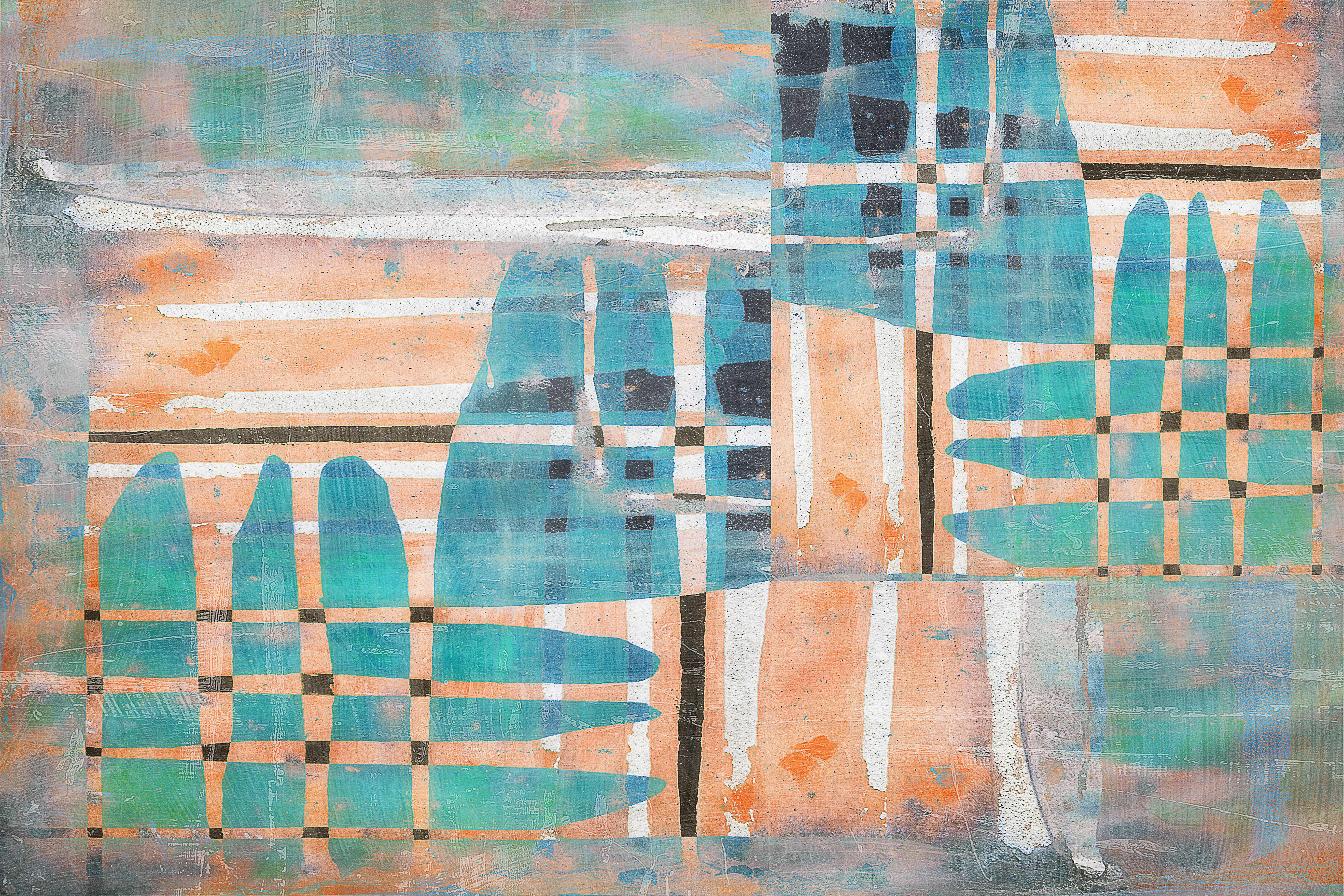


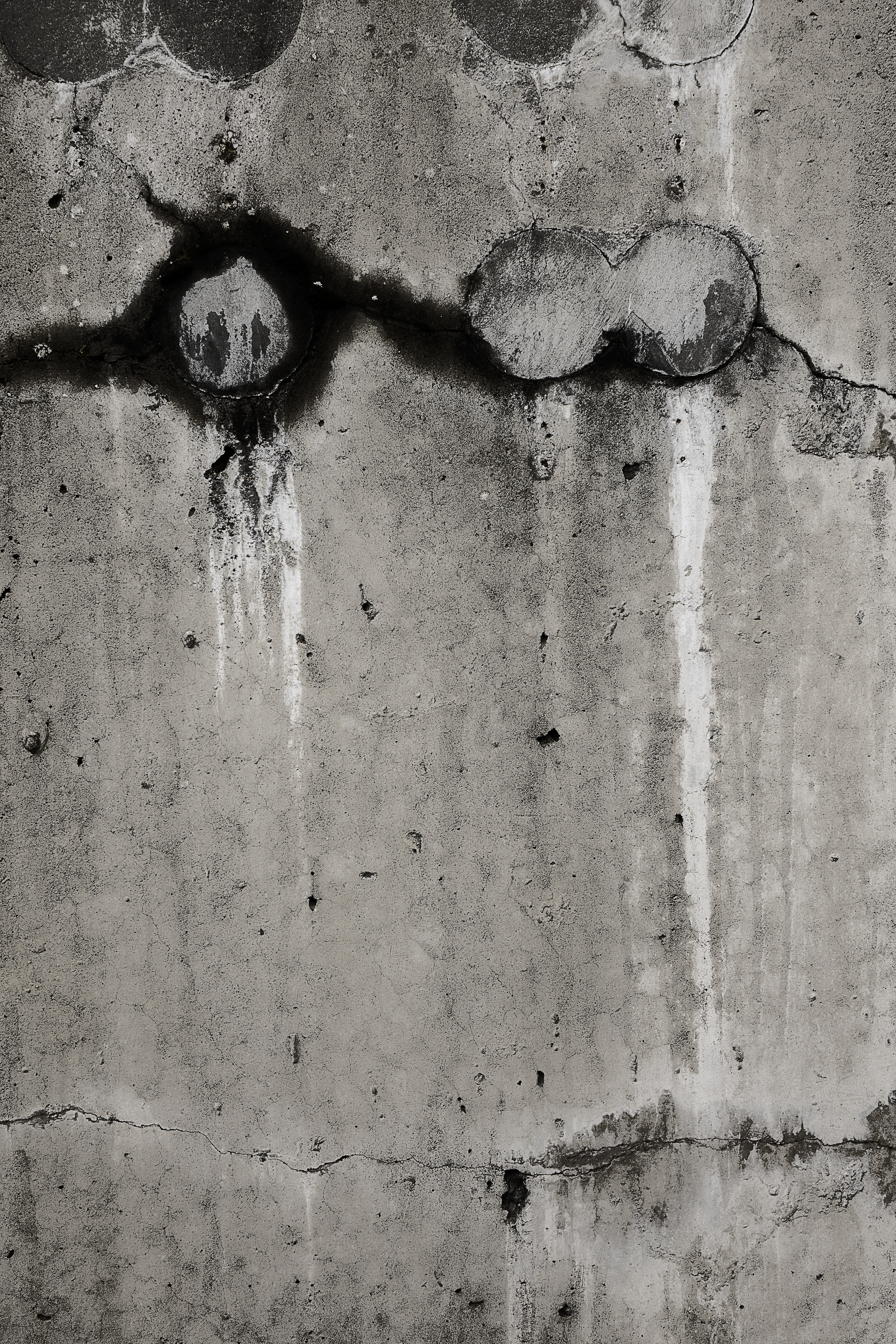
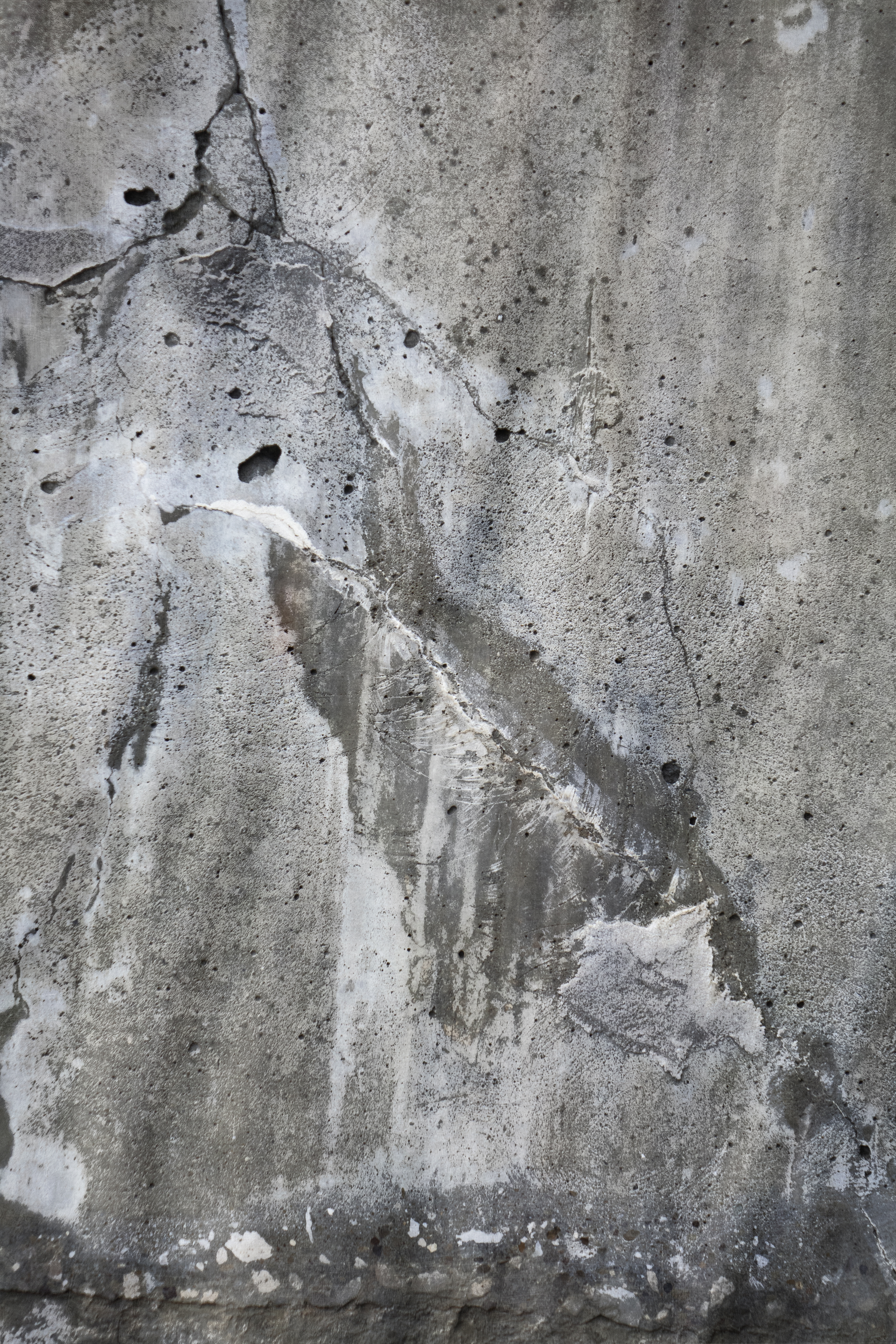
Three new digital photo-based creations... from left to right....
"Basket Weaving"
"Bleeding Throught The Night"
"The Architecture of Madness"
In the "MOMENT" https://youtu.be/lee7JSORJgg