
When everything we do is monitored – everything is condemned
Where everything is condemned – nothing is permitted
Where nothing is permitted – there is NO freedom.
Now’s the time to YELL FIRE!
When everything we do is monitored – everything is condemned
Where everything is condemned – nothing is permitted
Where nothing is permitted – there is NO freedom.
Now’s the time to YELL FIRE!
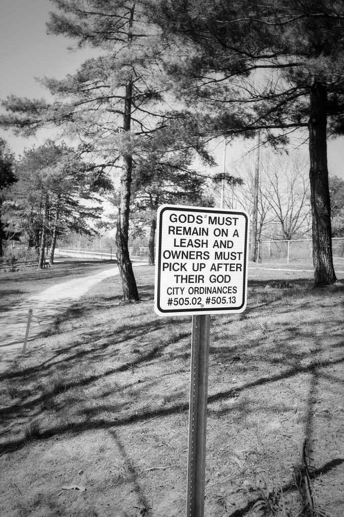
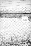
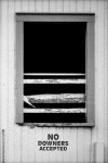
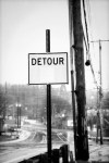
I once saw a sign and my first thought was, “Hmmmmph, that’s the story of my life!”…..
In the past few months I’ve noticed that has been my reaction to more and more signs. These signs just seem to be coming into focus of my awareness in a way they haven’t before. In fact there almost seems to be an oppression by signs. Some are just general informational signs. Things that announce operating hours, directions to a place, time it takes to get somewhere, who to call (and it ain’t Ghostbuster’s), and other general announcements. But I’m finding, and maybe it’s just my growing awareness, that more and more signs are dictating things. Signs that tell us to do one thing or another, telling us what we can and can’t do. And there are signs that are used to threaten and control…..
That is the focus of this new photo project I’ve started. These signs make up the story of our lives and can tell us things about ourselves, our culture, our perceptions and misconceptions about the world in which we live. So while one may dismiss these images in this project as just pictures of signs. I am asking the view to go further. To go beyond the obvious. To ask questions and let these signs bring new understandings.
Here are eight of the 20 odd images I’ve collected so far (in no particular order). Enjoy.


Is there such a thing as too much color?
In a world where saturated color and manipulated images have become the norm is black and white more real?
In our so-called modern society, and culture, image saturation is not only 360 degrees around us but also gets embedded in us as it’s imprinted on our minds. Technology now is primarily image based and all of it is in color; brilliant, vibrant, glowing, saturated color. Printed matter whether publications or advertising is 99% image-based.
Is there such a thing as too many images?
By having so many images do we become desensitized to the image and color?
Or, are we still in the process of becoming desensitized?
How much is too much?
I read a recent article in a publication that people today prefer to look at art online than actually going to a museum. Does this devalue art?
Well, these are just some of the things floating around in that vast empty space between my ears….. I had these thoughts as I have found that color images no longer interest me. I’ve gotten bored with images – specifically color images….. As a result, all my newer work is strictly in B&W. For me B&W feels more real. I find greater nuances in the images when I’m working in B&W. The image in B&W does not bore me – it makes me look closer. Will that change? Probably, at some time. But then, again, maybe not as long as our world is – the way it is.
Here are some recent B&W images I’ve created. Enjoy.
As always you can click on an image for a larger view and then use the arrows to advance to next image.


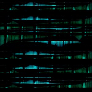
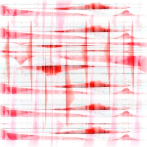
So I decided to play up the notion of dirty ice. Four images that I envision presented in the following manner. Definitely work viewing in full screen (in my opinion).


(you can “right click” then open in a “new tab” to view larger versions of individual images for more details.)


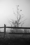
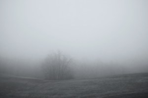
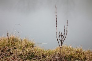
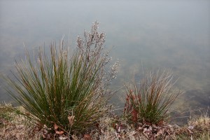
…one morning while in a foggy state of mind….I wandered the local hills as nature gave visual credence to my mood….in the fog when thoughts are distilled into the fine wine of wisdom, courage and faith….preparing one for action….
[fyi: after you click play for the music – if you right click on the first photo and open in new tab you can view larger versions while the music plays]


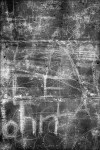
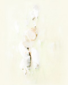
This is a selection from a series of images (so far totaling 30). In this series I am exploring the edge of image through over-exposure. All these images were taken on a photo-walk in downtown Akron one Sunday morning. Just more of my further adventures in Non-representational, non-pictorial and non-objectivism with the camera as my paintbrush. It was interesting when I submitted these to my printer they contacted me and were reluctant to print them because there was so much white. I assured them that this was intentional as I want to explore the very edge of photography and question what we define as a photograph. I’m glad I insisted. I just got the prints and they are gorgeous!
I’m imagining them all hanging on a wall next to each other much like this presentation here where they create details of a much larger work.
One of my favorite poets is Philippe Jaccottet; from Switzerland (the country of origin of my ancestors). Here are two quotes that Fit this series and the soundtrack that I’ve selected for this presentation.
“White as the absence of colour, or death;
white as the essence of color, or, perhaps,
life transcended.”“Things can fall apart again at any moment.
I can barely hold on to them, if I hold their shadows.
What I devour like a desirable meal is perhaps no more than absence.”~ Philippe Jaccottet
The soundtrack I’ve chosen for this is An Ending (Ascent) by Brian Eno.
Enjoy.


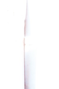
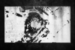
The continuing exploration of over exposure. This adventure began in my previous series “LUMINOUS IMPRESSIONS” [which can be seen here https://www.behance.net/gallery/24471909/Luminous-Impressions ] In some ways I think over exposure is a perfect metaphor for the internet era. When a photograph is over exposed it leads to “white out” situations where details become fuzzy and unrecognizeable. I wonder if that’s what will happen to us on the internet. Will too much exposure lead to a sort of personal and cultural blindness? And, is this a bad thing?
On the other hand – because of over exposure where things are not easily identified we are left to explore other realms of the over exposed image. It can give us new feelings and be an almost spiritual exploration into the non-pictorial and non-representational image. In other words, because we cannot readily identify something we are free to redefine it on our own mental, spiritual and emotional terms. Ten people can look at a photo of a kitten and all agree that it is a kitten they are viewing but when the image is over exposed each individual can come up with their own interpretation of what they are looking at.
Click “play on the video” then click on the first image and you will be able to see it large and then press arrow button to go to next image.


A GREAT documentary.
A Fabulous talk.
A fabulous talk and photographic art by Danish photographer/artist Per Bak Jensen.
